
I was at Isla de Nebz's place when I noticed this post. I kind of thinking; why not join. Nothing will be lost except some wasted effort on my part and perhaps a depleted ego if my work isn’t nominated. So I did some research and came up with these three logos.
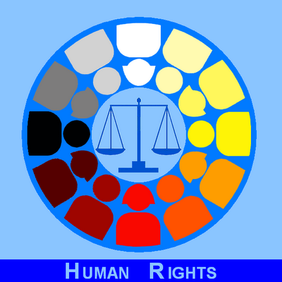
The first one represents the genders and the diverse races. The “scale” stands for equality and/or justice and the blue circle symbolizes our world.
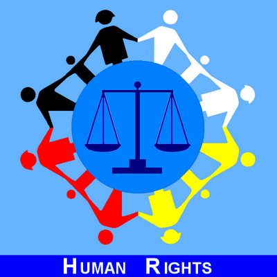
I modified the second logo to include children and the four colors (red, yellow, black and white) indicates the four major races. Both logos were titled: “Equality in a Diverse World”.

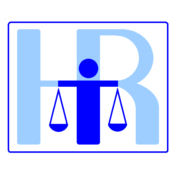
The third logo is quite simple. I combined the first letter of “Human” and “Rights” and put in the middle an abstract representation of “man” and “scale”.
As I browsed some of the other entries, I was surprised to find out I wasn’t the only one who had an idea of combining “man” and “scale” in their logos. Isn’t that amazing. Given a set of rules, humans will think matching ideas and create almost identical symbols.
If you have time, please visit this site. I know its quite tough browsing all the logos considering there are more than 8,000 entries as of now. But if you happen to like my logos, please don’t forget to push the “heart” icon at the upper right hand corner of the drawing. But before you do that, you have to “log-in” or “sign-up” first (FB or Tweeter accounts are accepted) or your “vote” won’t be registered.
Thank you.

The first one represents the genders and the diverse races. The “scale” stands for equality and/or justice and the blue circle symbolizes our world.

I modified the second logo to include children and the four colors (red, yellow, black and white) indicates the four major races. Both logos were titled: “Equality in a Diverse World”.
The third logo is quite simple. I combined the first letter of “Human” and “Rights” and put in the middle an abstract representation of “man” and “scale”.
As I browsed some of the other entries, I was surprised to find out I wasn’t the only one who had an idea of combining “man” and “scale” in their logos. Isn’t that amazing. Given a set of rules, humans will think matching ideas and create almost identical symbols.
If you have time, please visit this site. I know its quite tough browsing all the logos considering there are more than 8,000 entries as of now. But if you happen to like my logos, please don’t forget to push the “heart” icon at the upper right hand corner of the drawing. But before you do that, you have to “log-in” or “sign-up” first (FB or Tweeter accounts are accepted) or your “vote” won’t be registered.
Thank you.
I love the second logo which includes children!
ReplyDeletefor me the 3rd one most simple and direct to the point.
ReplyDeleteIt's going to be tough! I saw the entries. Ang hirap mamili. Good luck. Number 2 is also my choice.
ReplyDeletesheng, mommy ka talaga. : )
ReplyDeleteLifeMoto, I was considering that too that judges might be looking for something quite simple and identifiable ka agad.
Ka Rolly, oo, ang hirap nga. Marami ding magagandang gawa.
I liked the third one! Best of luck!
ReplyDeleteThanks Ms.Jo. Bomoto ka?
ReplyDeleteI like the simplicity of the third one. Best of luck to you.
ReplyDeletei like the second one but the third is simple and direct to the point.
ReplyDeletebertN, in a way, I also prefer the 3rd one.
ReplyDeletebing, yung 2nd and 3rd medyo nasa gitna ang ranking out of 10,000 plus entries.
Nice Logo's but I'll go for the 2nd.
ReplyDeletei love the first one. i love the changing hues for the various races
ReplyDeletebakit wala comment ko? anyways galing mo talaga magdrawing idol! hehehe gusto ko lahat pero yun simple gusto ko rin yun 3rd one...good luck ha ;-P
ReplyDeleteGawwy, thanks for visiting my site.
ReplyDeleteatticus, salamat, kaso talo.
Sardz, kahit ako gusto ko rin yung 3rd, but in the final ranking, pang 5900 yung 3rd logo out of 15000+ entries. Hindi man lang pumasok sa top 300.
uy sayang,tapos na pala...ok yung pang 3
ReplyDelete~lee